Designing User Interviews Tool for Lyssna
My Impact
As the lead designer, I drove this project from concept to delivery by:
Conducting user research with over 20 participants to uncover pain points and unmet needs.
Creating a detailed customer experience map to identify opportunities for innovation.
Designing a vision prototype that aligned stakeholders and set a clear direction for the team.
Prioritising features into must-have, good-to-have, and nice-to-have categories, ensuring focus on user needs.
Collaborating with engineering to translate designs into actionable user stories and shaping MVP.
Iterating on the MVP based on user feedback, refining the product to maximise customer satisfaction.
Background
UsabilityHub is an Australian SaaS platform specializing in user research and usability testing. Known for its unmoderated usability testing tools like five-second tests and prototype tests, the platform had built a reputation for simplicity and ease of use. The company’s vision was to grow into a comprehensive "Swiss army knife" for user research, covering 80% of product research needs. However, the platform lacked support for moderated studies, a critical piece of that vision.
Problem
Through user feedback and churn data, it became clear that offering face-to-face interviews within the platform would add significant value. Researchers frequently described interviews as their most-used method, and without moderated studies, users often turned to competitors. This led to our main objective:
Build a moderated study feature to tackle the challenges of finding, screening, and scheduling participants, as well as managing incentives, thereby enhancing the platform’s appeal and increasing customer retention.
Discovery
Given the size and complexity of the project, we committed to a deep-dive discovery phase, spanning a full month. During this time, we interviewed over 20 people from diverse backgrounds and regions. We explored their research habits, challenges, and unmet needs, as well as what they appreciated about their current workflows.
From these conversations, we created a customer experience map to visualize how users typically moved through their research process. This map helped us uncover opportunities for improvement. Based on those insights, we defined jobs to be done and categorized them into three buckets:
Must have – Absolutely critical for users’ workflows. These should be good enough to pull any users from their current workflow to try this tool for free.
Good to have – Meaningful enhancements that could serve as competitive advantages but weren’t essential at launch. These features could draw in free users to ‘paid plans’.
Nice to have – Optional features that could delight users or serve a niche, which could be good candidates for paid features.
This categorization provided us with a clear and structured roadmap of priorities, allowing us to focus initially on the features that mattered most to our users. Additionally, it helped us significantly later in determining which features and functionalities should be included in our free plan in comparison to our paid plans.
Strategy
With these insights in hand, we defined a set of guiding principles to steer the design process:
Familiar Patterns: Align the workflow with how users already set up unmoderated tests, so they feel at home right away. Also by utilising existing UI components we can build faster.
Ridiculous Simplicity: We aimed to create an experience that would feel delightfully easy compared to their current experience. This will be critical for the tool’s adoption, retention and word-of-mouth.
Focus on Core Needs: Prioritise the must-have features—invites, screeners, calendar integration, and automated communications. These formed the basis of what will be included in free vs paid versions.
Trusted Integrations: Use integration with well trusted tools like Zoom, Google Meet, Teams, Google calendar, etc instead of forcing users into proprietary solutions.
The goal was to make the new feature feel like an enhancement to their existing workflow, not an entirely new process.
Design process
Armed with clear priorities, we spent another month creating a vision prototype. This prototype mapped the entire flow for moderated interviews, from participant invitations to scheduling and reminders. Every detail was carefully considered, and we documented assumptions, questions, and decisions along the way. The prototype served as a shared language across teams, helping everyone align on what success looked like.
The prototype became our single source of truth, allowing us to vet ideas early. Once we were confident in the direction, we translated these concepts into user stories.
To validate our approach, we focused on delivering a Minimal Viable Product (MVP). The goal was to get a usable version of the product into users’ hands quickly and gather real-world feedback.
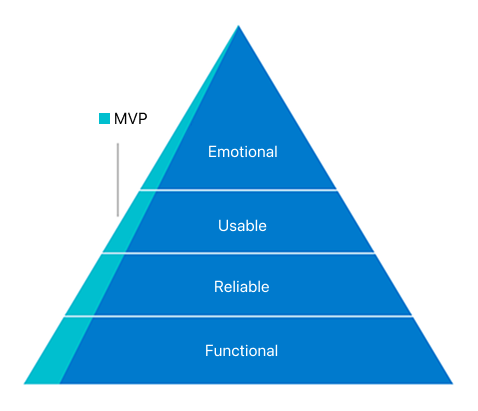
Functional: We wanted to ensure the MVP had everything needed to support users’ current workflows, giving it the best chance to succeed in replacing their existing processes. This meant prioritizing essential features were in place from the start.
Reliable: We wanted to earn user trust by integrating with third-party solutions they already rely on, such as Zoom, Google Meet, and Teams, and ensuring they worked as expected. At the same time, we were mindful of the variations in user workflows and aimed to support different ways of working rather than forcing a one-size-fits-all approach.
Usable: Keeping familiarity with unmoderated studies was key, so we leveraged familiar UX patterns to make the transition seamless. This was achieved through a robust design system that ensured consistency, clarity, and ease of use across the experience.
Emotional: We ensured the product created an emotional connection through thoughtful use of language, visuals, and interactions that always feel inviting and alive. A clean layout, strategic use of color, and carefully designed interaction patterns contributed to an experience that felt polished, engaging, and approachable.
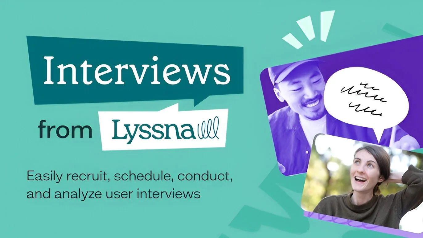
Final MVP
A product walkthrough of Interviews feature from Lyssna
Outcome
With the MVP we wanted to validate our strategy and these were the key learnings:
What’s the appetite for a moderated studies feature from the current user base? 🤔
High! Over half of the active users created at least one ‘Interviews’ project, confirming strong demand. Familiar workflows made it easy for them to get started. ✅
Do familiar UX patterns from unmoderated studies make it easier to set up moderated studies? 🤔
Yes! Users found the setup process smooth and intuitive, thanks to familiar workflows. They were able to get started without much friction. ✅
Is it easier to conduct user interviews compared to the current process? 🤔
Definitely! Users described the experience as much easier, with one even calling it “ridiculously simple—almost too easy.” Some completed 20 interviews in a week—their fastest pace ever. ✅
Does the MVP have everything needed to replace users’ current workflow? 🤔
For the most part, yes! Essential features like invites, screeners, calendar integration, and automated communications were well-received. We also identified opportunities to make them even better. ✅
Do third-party integrations like Zoom, Google Meet, Teams, and Google Calendar feel & work seamlessly? 🤔
Yes! Users liked the flexibility of using their preferred tools instead of being locked into proprietary solutions and they worked as expected. We also learned what other integrations to explore next. ✅
However, we also found that in the quest to make the interface less intimidating and more friendly, some important controls were less visible than expected. This made users a bit uncertain about their choices and actions, even though everything functioned correctly. To improve the user experience, we quickly identified key usability changes like enhancing control visibility, adjusting default settings etc.
As feedback poured in from various internal and external users, we continued iterating the MVP, and prioritized our roadmap.
The success of the moderated study feature confirmed that both our experience strategy worked. Users quickly adopted the feature, found it easier than their existing process, and resulted in higher engagement. Their feedback not only validated our approach but also gave us permission to build further, uncovering new opportunities to add value through enhancements and deeper integrations. This strong foundation set the stage for continued growth and expansion.
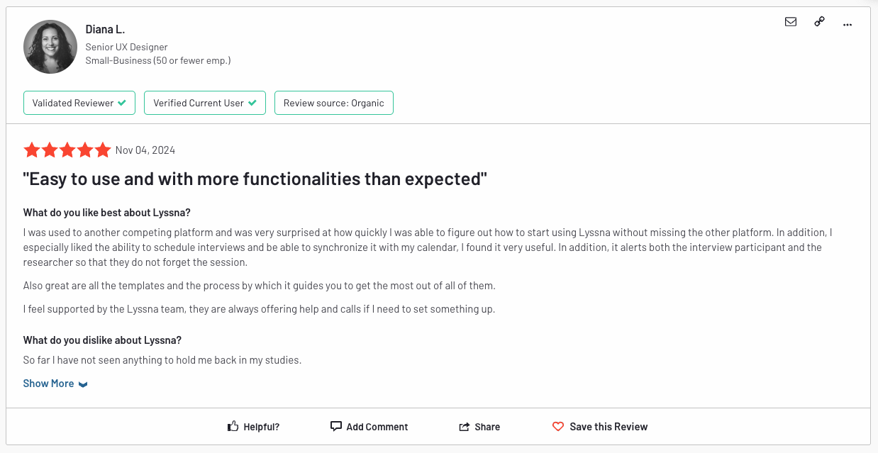
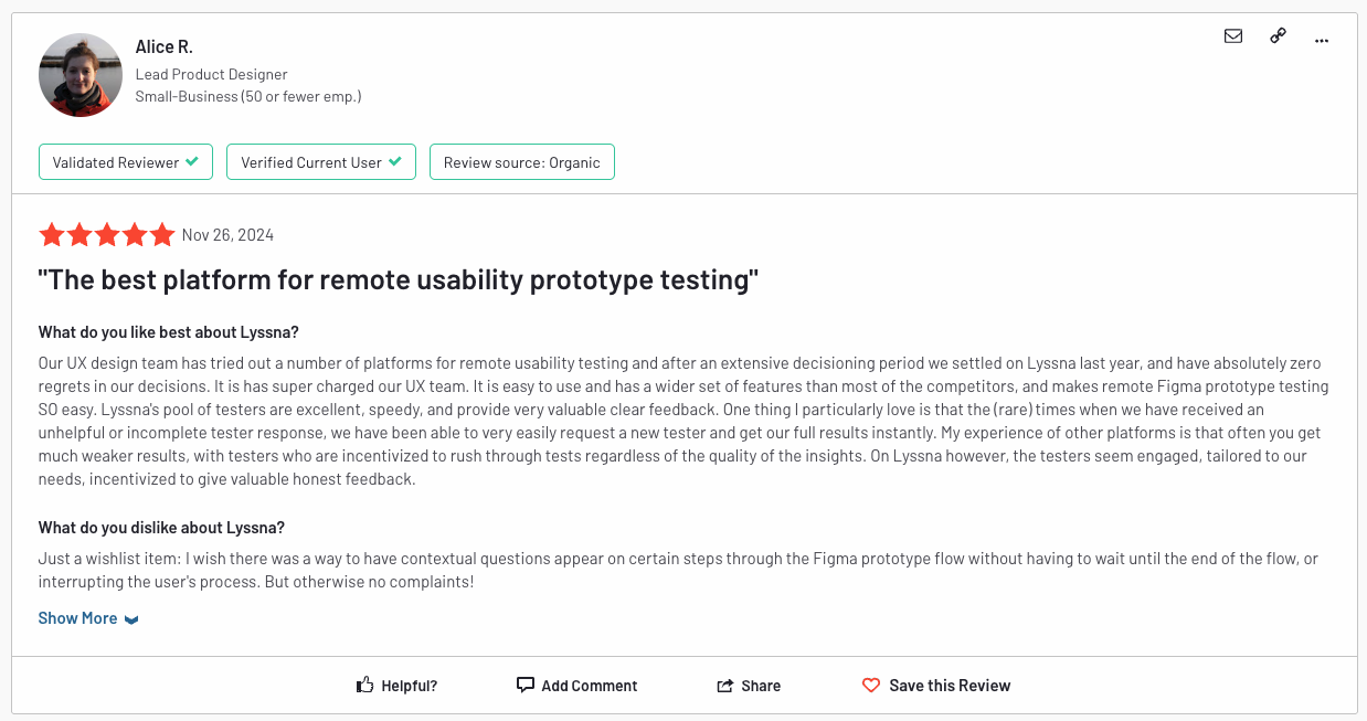
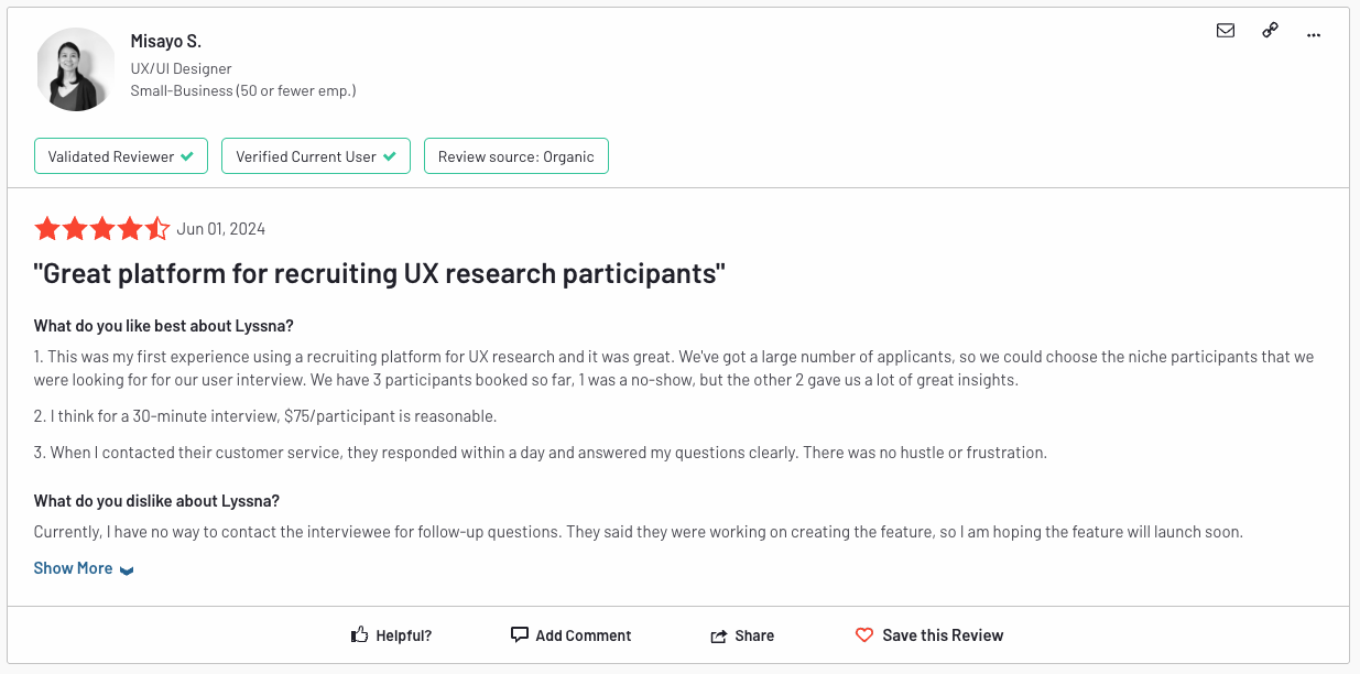
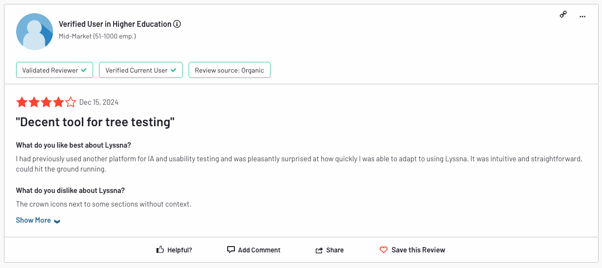
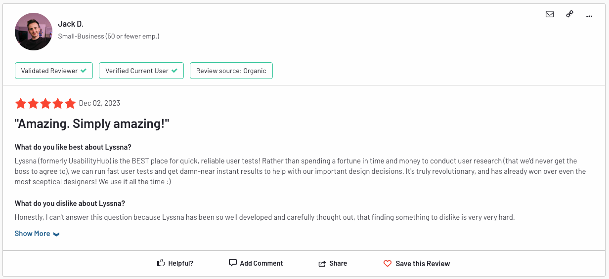
Check out what people are saying about the features I designed for Lyssna—prototype test, card sort test, interview scheduling, screeners, and many tweaks to enhance ease of use.